The Psychology of Typography in Luxury Web Design for Female Entrepreneurs
Typography isn’t just about picking pretty fonts. It’s about creating an emotional connection with your ideal clients before they even read your first word in luxury web design.
As female entrepreneurs, we understand the power of first impressions. Your website typography is silently communicating your brand values, expertise level, and whether you’re the right fit for your dream clients. Get it wrong, and potential clients scroll away within seconds. Get it right, and you’ve created an instant sense of trust and luxury that converts browsers into buyers.
Why Typography Psychology Matters for Female-Led Businesses
Female entrepreneurs often serve clients who make purchasing decisions based on emotion and trust. Your typography choices directly influence these emotional responses. When a potential client lands on your website, their subconscious mind is already forming opinions about your professionalism, attention to detail, and whether you understand their needs.
Luxury typography communicates that you value quality, understand sophistication, and deliver premium experiences. This is especially crucial for service-based female entrepreneurs who need to establish credibility quickly in competitive markets.
The Science Behind Font Psychology
Different font families trigger distinct psychological responses in luxury web design:
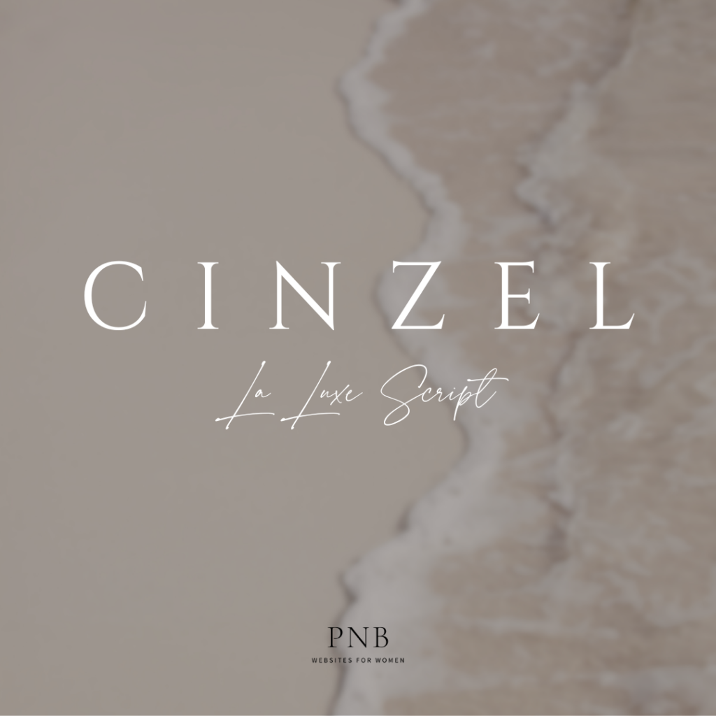
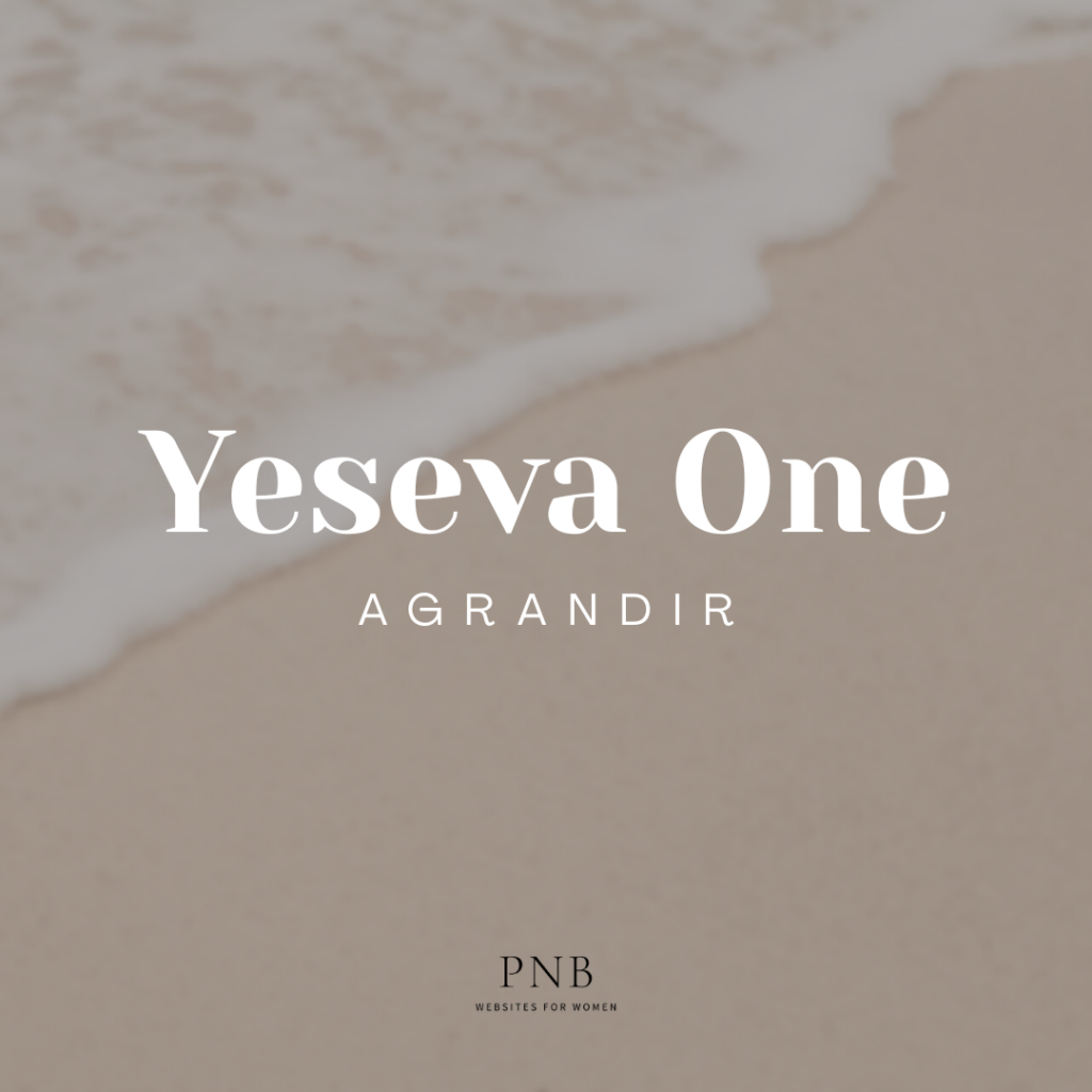
Serif Fonts (like Times New Roman or Playfair Display) convey tradition, reliability, and sophistication. They’re perfect for coaches, consultants, and established service providers who want to communicate expertise and trustworthiness.
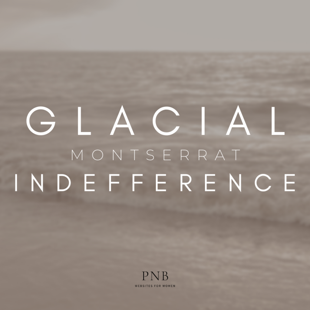
Sans-Serif Fonts (like Helvetica or Montserrat) feel modern, clean, and approachable. They work beautifully for creative entrepreneurs, wellness professionals, and anyone targeting younger demographics.
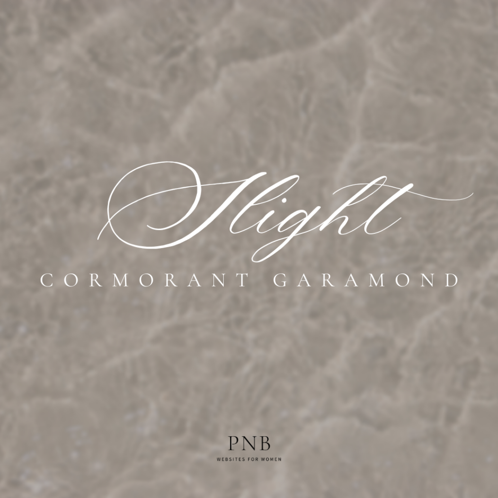
Script Fonts add personality and elegance but should be used sparingly. They’re ideal for feminine brands that want to communicate creativity and personal touch.
Display Fonts make bold statements but can quickly overwhelm. Use them strategically for headlines when you want to create impact.
Creating Hierarchy That Converts
Your typography hierarchy guides visitors through your content and toward your call-to-action buttons. Here’s how to structure it for maximum impact:
Headlines should be bold and commanding, using fonts that reflect your brand personality. They need to grab attention while remaining readable across all devices.
Subheadings break up content and keep readers engaged. Choose fonts that complement your headlines without competing for attention.
Body Text must prioritize readability. No matter how beautiful a font looks, if your ideal clients can’t easily read your content, they’ll leave.
Call-to-Action Text should stand out from your body text. Consider using a slightly different weight or style to draw the eye naturally toward conversion points.
Mobile-First Typography Strategy
With most of your potential clients browsing on mobile devices, your typography choices must work flawlessly on smaller screens. This means:
- Choosing fonts that remain legible at smaller sizes
- Ensuring adequate line spacing for easy reading
- Testing your font combinations across different devices
- Prioritizing loading speed (some custom fonts can slow down your site)
Building Trust Through Consistent Typography
Consistency in your typography choices builds subconscious trust with your audience. When fonts, sizing, and spacing remain consistent throughout your website, visitors feel more confident in your attention to detail and professionalism.
This consistency should extend beyond your luxury web design to your email newsletters, social media graphics, and any downloadable resources. Your typography becomes part of your brand recognition, helping ideal clients instantly identify your content across platforms.
Luxury Typography Mistakes to Avoid
Using Too Many Font Families: Stick to 2-3 font families maximum. More than that creates visual chaos and dilutes your professional image.
Ignoring Readability for Style: Beautiful fonts mean nothing if your ideal clients can’t read your content comfortably.
Forgetting About Loading Speed: Custom fonts can significantly slow down your website, frustrating potential clients before they even see your content.
Neglecting Accessibility: Ensure your font choices work for visitors with visual impairments or reading difficulties.
Your Typography Reflects Your Brand Values
Every typography choice you make sends a message about your business. Luxury web design for female entrepreneurs requires intentional font selections that communicate professionalism, attention to detail, and understanding of your ideal client’s needs.
When you invest in thoughtful typography, you’re investing in the psychological impact of your brand. You’re creating an environment where your ideal clients feel understood, valued, and confident in your ability to serve them at the highest level.
Ready to Transform Your Website Typography?
Your website typography is working for you or against you right now. If you’re ready to create a luxury digital presence that converts browsers into buyers, let’s talk about how strategic design choices can transform your business.
Your ideal clients are looking for someone who understands both the technical aspects of great design and the psychology behind what makes them feel confident in their purchasing decisions. When your typography aligns with your brand values and speaks directly to your audience’s subconscious needs, magic happens.
Leave a Reply

© 2024 Petal & Bloom Tech Marketing | All Rights Reserved

book consult
view resources